
Smart Data Visualization and Personalized Dashboards Improve Data Insight and Team Collaboration!
Augmented Analytics was designed to remove the barriers erected by the traditional business intelligence and analytics solutions. In order to achieve data democratization and improve data literacy among team members within an enterprise, the organization must provide simple, easy-to-understand solutions that display analytical results in a way that is meaningful and intuitive.
‘Visual Analytics tools enable users to identify relationships, patterns, trends and opportunities and to explore detailed data with simple drill down and drill through capabilities and make sense of data from all sources.’
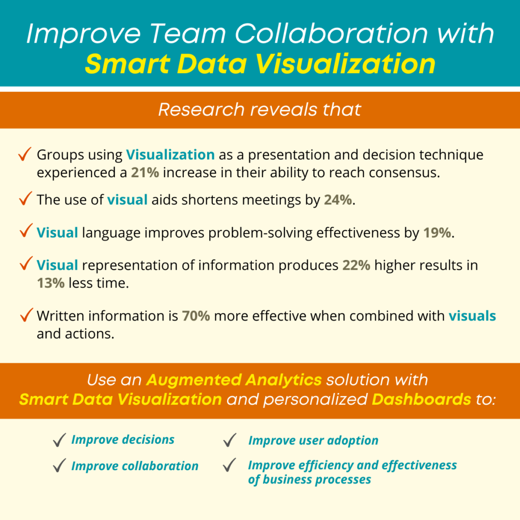
Research reveals that
- Groups using visualization as a presentation and decision technique experienced a 21% increase in their ability to reach consensus.
- The use of visual aids shortens meetings by 24%.
- Visual language improves problem-solving effectiveness by 19%.
- Visual representation of information produces 22% higher results in 13% less time.
- Written information is 70% more effective when combined with visuals and actions.
When a team member has access to data analytics and the ability to see information within a personalized dashboard in a way that is meaningful to them, they are more efficient and effective and can complete tasks more quickly. When data is presented using intuitive visualization methods, it is easier to review information and quickly understand results and outcomes, and easier for a team or group to make an informed decision.
There is no guess-work, or need to request assistance from a data scientist, business analyst or IT professional. Team members can leverage their own knowledge and skill to gather and analyze data to make a confident decision and to collaborate with other users and team members.
Current smart data visualization tools allow business users to view and analyze data to identify a problem and clarify a root cause and to make confident decisions. Business users can interact easily with analytics software and build a view that will tell a story using guided visualization and recommended data presentation so there is no need for assistance or delays. Guided recommendations are made based on data type, volume, dimensions, patterns and nature of data.
By combining cutting-edge technology and machine learning on the backend, with an intuitive user experience on the front end, business users can easily leverage sophisticated tools with suggestions and recommendations on how to personalize data displays to create meaningful views and collaboration.
Machine learning provides guidance to determine the visualization technique that will be the best fit for the data business users want to analyze. It allows for better understanding of data, and identifies unusual patterns in data, and achieves the best output and results.
‘In order to achieve data democratization and improve data literacy among team members within an enterprise, the organization must provide simple, easy-to-understand solutions that display analytical results in a way that is meaningful and intuitive.’
Visual Analytics tools enable users to identify relationships, patterns, trends and opportunities and to explore detailed data with simple drill down and drill through capabilities and make sense of data from all sources, with a guided approach that allows users to identify patterns and trends, and quickly complete analysis with clear results.
Smarten Smart Data Visualization Tools and BI Dashboards support your team with tools that are intuitive and easy to use and will encourage user adoption. Leverage the essential components of Augmented Analytics and improve decision-making and outcomes.
 Advanced Analytics for Business User, Advanced Analytics Tool, BI Tools, Dashboard Software, Dashboard Tools, Data Literacy, Data Visualization Software, Modern BI, Smart Data Visualisation, Smart Data Visualization Ahmedabad